

%20(1).jpg)
The Finish Is the First Impression: Why the Best Print Pieces Are the Ones You Can Feel
Every marketer is fighting the same problem right now: the audience has gotten very, very good at not seeing you.
Banner blindness. Scroll-past thumbs. Inboxes that get triaged in half a second. The average person is exposed to thousands of ads a day, and their brain has adapted the only way it knows how — by learning to ignore most of them.
Print doesn't get a free pass here. Even inside a channel that's proven to outperform digital, a flat sheet of paper with ink on it can still read as forgettable — another piece headed straight for the recycling bin before anyone really looks at it. The message might be great. The offer might be compelling. But if the piece doesn't do anything different the moment it's held, it's leaving its biggest advantage on the table.
This is where specialty finishes stop being a "nice to have" and start being the thing that actually gets a piece noticed, held onto, and remembered.
Specialty finishing is just one of the many things we specialize in at Lahlouh — foil, emboss, spot UV, soft-touch, specialty inks, all of it — and it's also one of the areas clients lean on us for most, because it's the easiest part of a project to get wrong. If you've got a piece coming up that needs to do more than sit flat on a desk, let's talk about which finish actually fits it.
Why Touch Still Beats Everything Else
There's real research behind this, not just intuition.
A neuroscience study commissioned by Canada Post used EEG and eye-tracking to compare how the brain processes physical mail versus digital media. The premise was specifically about touch: researchers set out to understand whether the tactile, physical nature of mail — the simple fact that it's an object you hold, versus a screen you look at — changes how people process and respond to it. The findings backed that up. Physical mail required meaningfully less cognitive effort to process than digital content, and it produced significantly higher brand recall.¹
Translation — a printed piece with a tactile element doesn't just get noticed. It gets remembered, and it gets remembered with less work from the reader's brain.
The mechanism is straightforward once you think about it. Texture and dimension create sensory engagement that a screen simply can't replicate. Soft-touch coatings, embossed elements, and raised finishes read — subconsciously — as higher quality. The brain links physical substance and tactile richness with credibility and value, often before a single word gets read. A luxury message printed on flat, thin stock creates a kind of quiet dissonance. The right finish removes that friction entirely — it reinforces the message instead of undercutting it.
That's the case for specialty finishes in one sentence: the finish is part of the message, whether you plan for that or not.

A Quick Field Guide to the Finishes Worth Knowing
Specialty finishing is a broad category, and not every technique fits every project. Here's how we think about the major players.
Foil Stamping
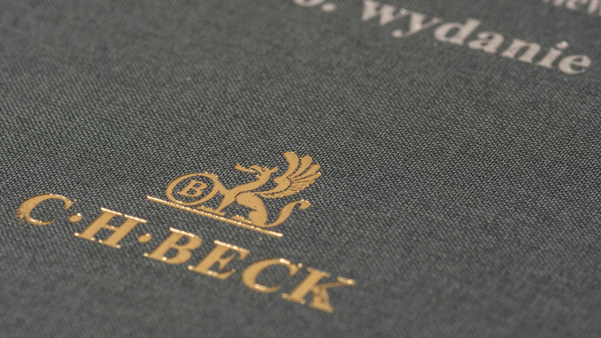
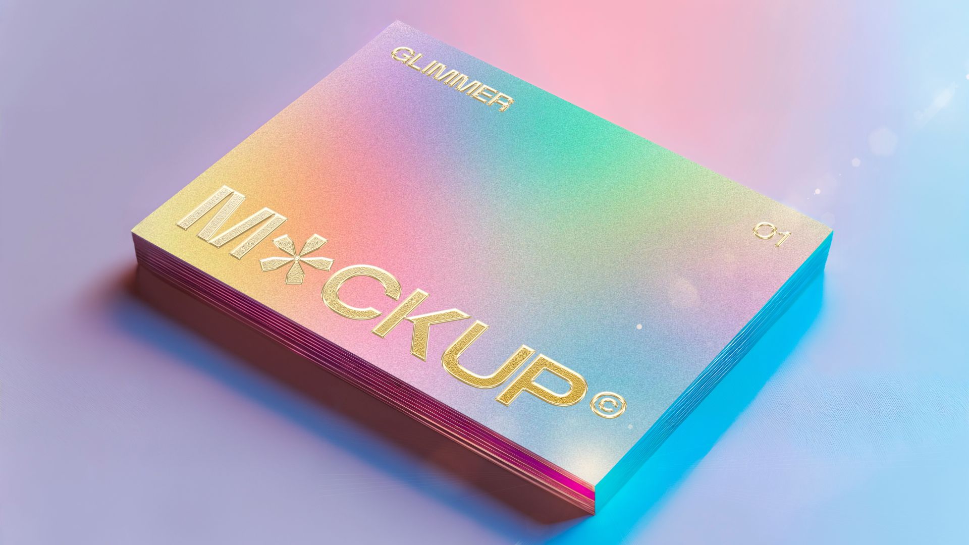
Hot foil stamping presses metallic or holographic foil onto the substrate using heat and pressure, producing a reflective finish that catches light — and attention — from across a room. It's one of the most durable finishes available: foil resists the oils and handling that cause standard ink to fade or smudge, which is part of why it shows up so often on anything meant to be kept — invitations, packaging, book covers, premium business cards. Gold and silver remain the classics, but holographic and color-shift foils are showing up more in 2026, particularly on luxury packaging and limited-run pieces.
Embossing & Debossing
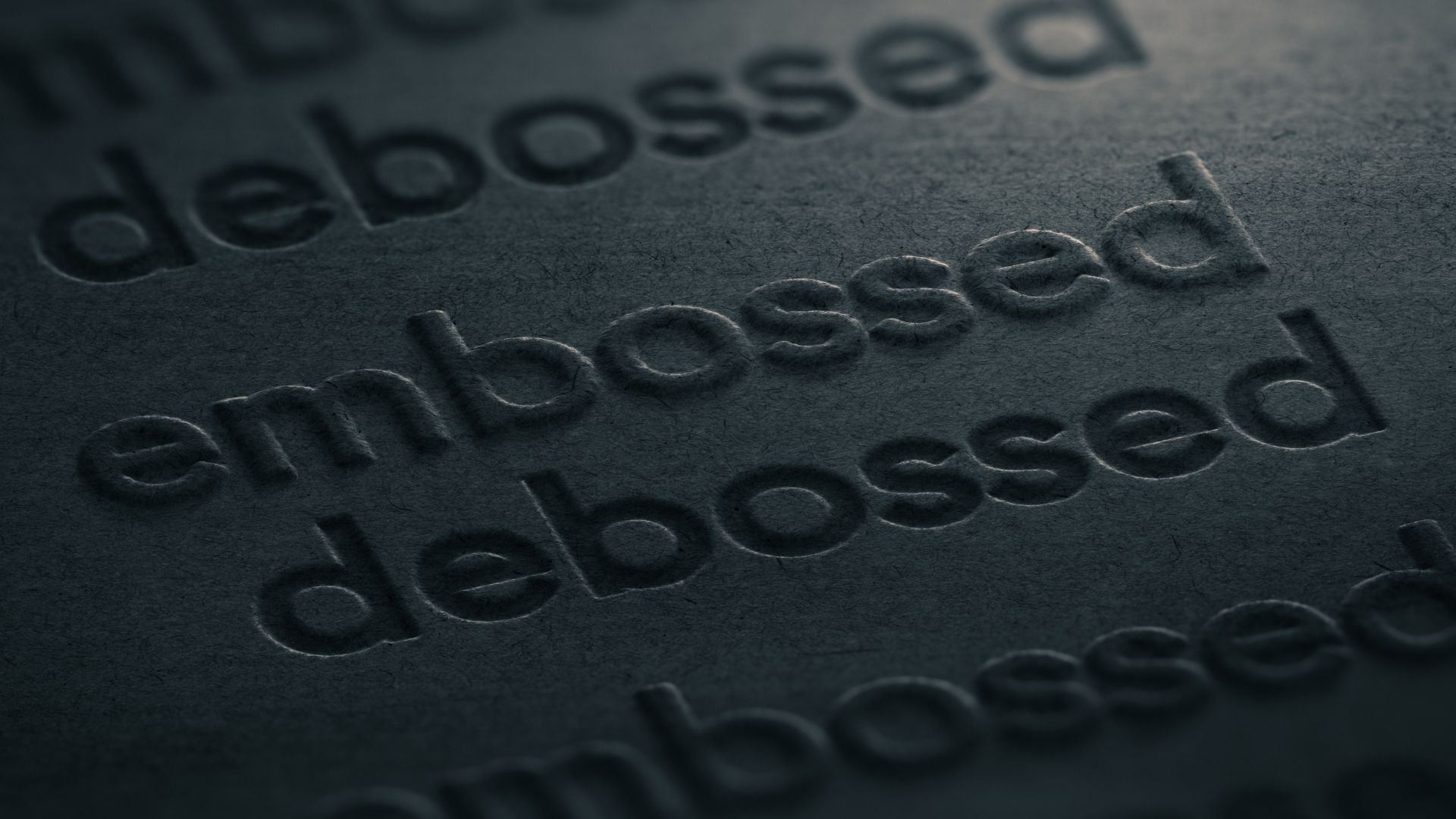
Embossing raises a design above the surface of the paper; debossing presses it below. Both work by physically reshaping the substrate, which means the effect is felt as much as it's seen. There are a few variations worth knowing:
- Blind emboss — raised texture with no ink or foil, relying purely on shadow and dimension. Understated, and often the most elegant option on a heavier, textured stock.
- Registered emboss — embossing aligned precisely with printed or foiled elements, adding depth to art that's already there.
- Combination emboss — embossing paired with foil stamping for maximum impact, most often reserved for the pieces meant to feel unmistakably premium.
Spot UV & Raised Spot UV
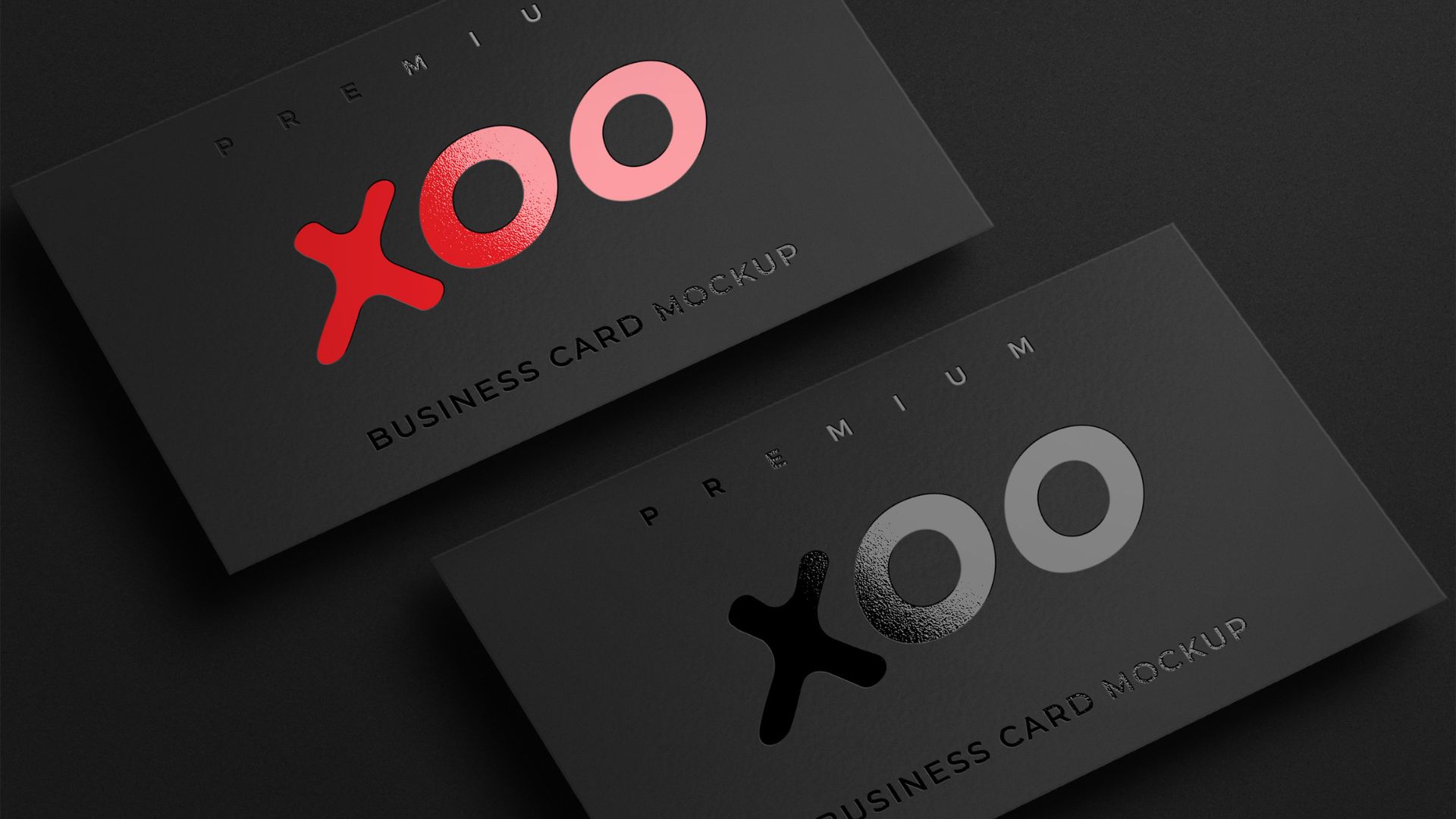
A high-gloss coating applied to specific areas of a printed piece, creating contrast against a matte or uncoated background. It's subtler than foil or emboss, which is exactly why it works well for brands that want polish without shouting about it — a logo that catches light at an angle, a headline that reads as slightly elevated without changing the color at all. Raised spot UV adds a texture component on top of the shine, giving it a dimensional quality closer to embossing.
Soft-Touch & Textured Laminates
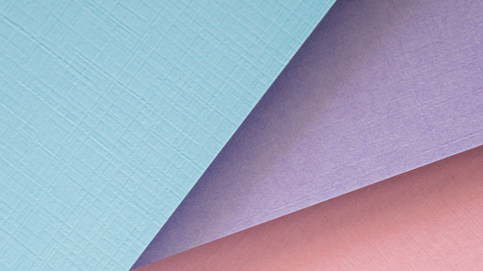
A velvety, matte coating that changes how a piece feels in the hand before anyone reads a word. It's become one of the most requested finishes across categories in 2026 — business cards, packaging, folders — because it signals care and quality with a single touch, and it pairs well as a base layer under spot UV or foil for contrast.
Specialty Inks
Metallic inks, textured varnishes, and even thermochromatic (color-shifting) or glow-in-the-dark inks are gaining ground, particularly in premium packaging and limited-edition promotional runs. These effects create a genuine "wait, what?" moment — the kind of detail that gets photographed and shared, not just noticed and set down.
Dimensional Formats
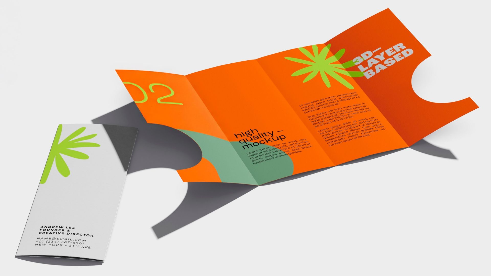
Not every upgrade lives on the surface. Structural formats — pieces that unfold, pop up, or open like packaging rather than simply lying flat — create a physical experience before the reader gets to a single finish. A mailer that opens like a gift box asks something different of the recipient than a flat sheet with a foil logo on it, even before you've decided which finishes go on top. It's worth thinking about structure and surface as two separate decisions, not one — some of the most memorable pieces we've produced pair a simple, elegant finish with a format that genuinely surprises the reader when it arrives.
Choosing the Right Finish Isn't About Choosing the Boldest One
The instinct with specialty finishes is often to reach for the most dramatic option available. That's usually the wrong instinct.
The better questions are the same ones we ask about any print project:
- What does the brand actually sound like? A modern, minimal brand often reads better with the restraint of spot UV or soft-touch than with heavy foil and emboss. A classic or luxury brand can usually carry more.
- What's the piece supposed to survive? Something meant to sit on a desk for years — a keepsake box, a premium notebook — earns the investment of a more durable, elaborate finish. Something with a shorter shelf life doesn't need to compete for the same budget.
- Who's actually receiving it? B2B materials for professional services audiences tend to succeed with subtlety. Consumer-facing or luxury pieces can carry a bolder statement.
One or two deliberate details, chosen well, will always outperform five techniques stacked together for the sake of it. The goal isn't to prove a finish exists — it's to make the piece impossible to set down without noticing it.
Specialty Finishes Can Lower Your Postage, Too
Here's a detail worth building into your plan early: the USPS's 2026 promotions calendar specifically rewards this kind of work. Scented paper, specialty inks, and textured finishes are named qualifying elements for several current postage discounts.
Done right, the same finish that makes a piece more memorable can also make it cheaper to mail. That's not a reason to add a finish that doesn't belong — but it's a good reason to build it into the plan early, before your format is already locked.
One important reminder: every promotion requires advance registration through the USPS Mailing Promotions Portal, and your design and campaign elements need to be approved before you mail. Late registration is the number one reason clients miss out on these savings — so if a specialty finish is part of your plan, loop us in early enough to register it properly.
.jpg)
Why This Is Where Lahlouh Earns Its Keep
Specialty finishing is unforgiving. Foil that isn't vented properly traps air and bubbles. Emboss and foil combined over heavy ink coverage can compromise the bond between the two. Registration on a raised spot UV that's a fraction of a millimeter off is immediately visible to the eye, even if no one can say exactly why the piece looks slightly wrong.
This is precision work, and it's the kind of work that gets worse — not better — the more hand-offs it goes through. When the same team that designed the piece is also running the press, setting the dies, and proofing the registration, the finish comes out the way it was actually intended. When it's split across a designer, a separate print vendor, and a separate finishing house, something gets lost in translation almost every time.
At Lahlouh, specialty finishing lives in-house alongside everything else we do — design, print, packaging, kitting, and fulfillment, all under one roof, all through one contact. That means we're not quoting out your foil work to a finishing house three states away and hoping the registration holds. We're proofing it in the same building where we designed it, printed it, and where it'll get packed and shipped.
The finish is often the last five percent of a project. It's also, more often than not, the five percent someone actually remembers.
Have a piece that deserves more than flat ink on paper? Let's talk.
Sources:
¹ Canada Post / True Impact neuromarketing study, cited via Printing Impressions (PI World), 2026.
.jpg)
.jpg)
.jpg)


